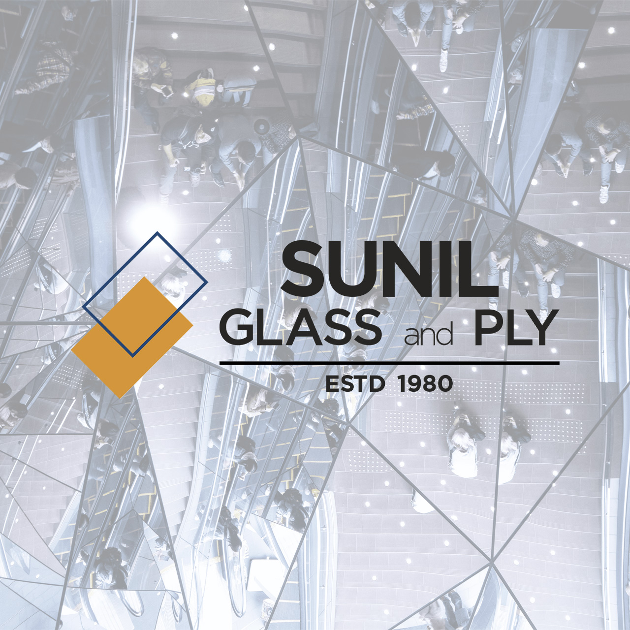
Sunil Glass and Ply
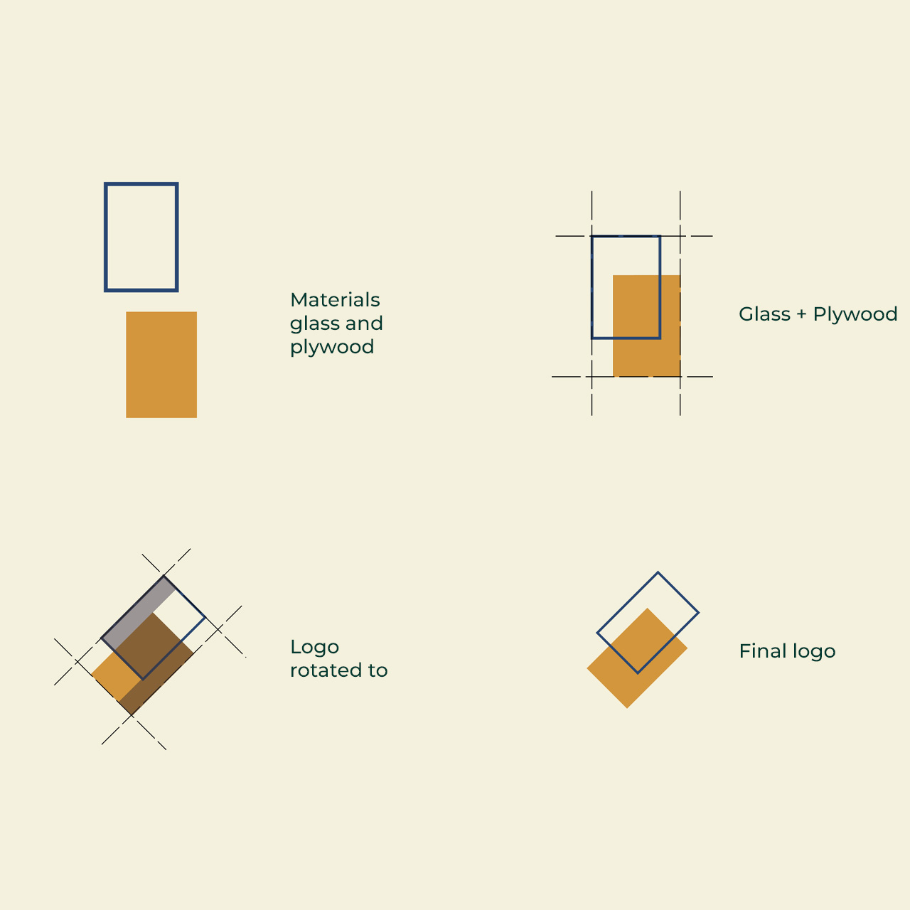
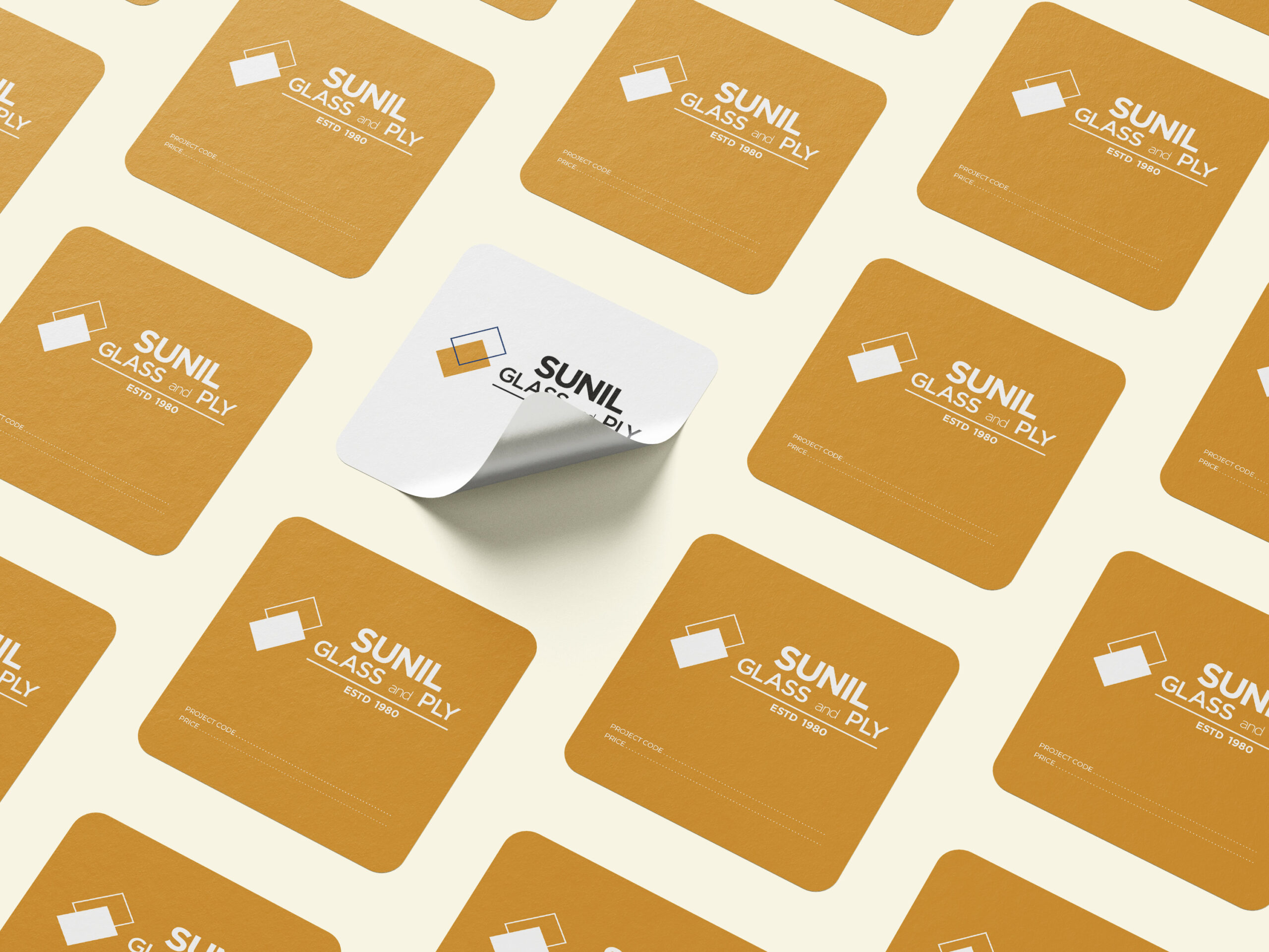
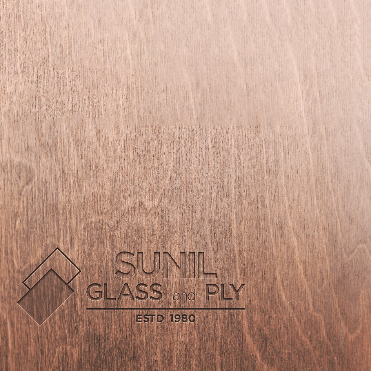
While the store of Sunil Glass and Ply was undergoing an interior revamp, the branding and identity of the store also needed a refresh. The logo and identity had to be simplistic and reflect the two primary materials sold at the store – ply and glass.
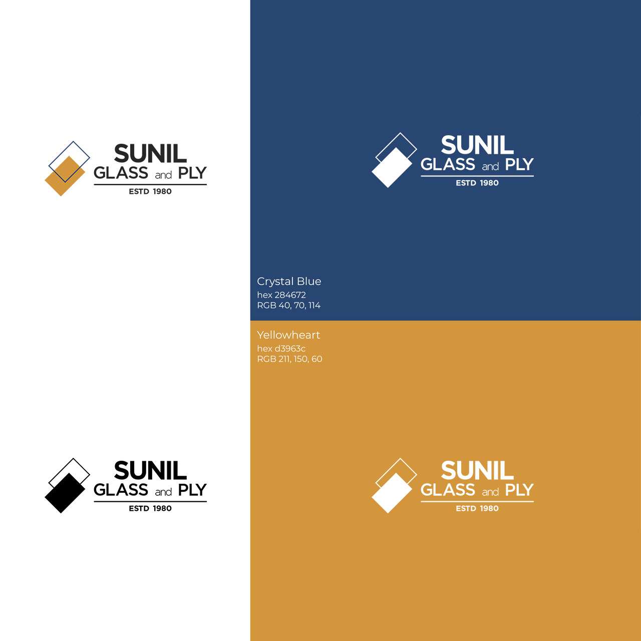
Two rectangles, one with a solid colour fill represent the ply, and the one without a colour fill represents the glass. The two rectangles are arranged one over the other and rotated to symbolise the letter S. The brand colours yellow and blue have been prominently used in the interior design. You can learn more about the interiors of this by clicking here.
Client:
Mr. Sachin KumarLocation:
BengaluruScope:
Design and identityCategory:
Graphics / Identity