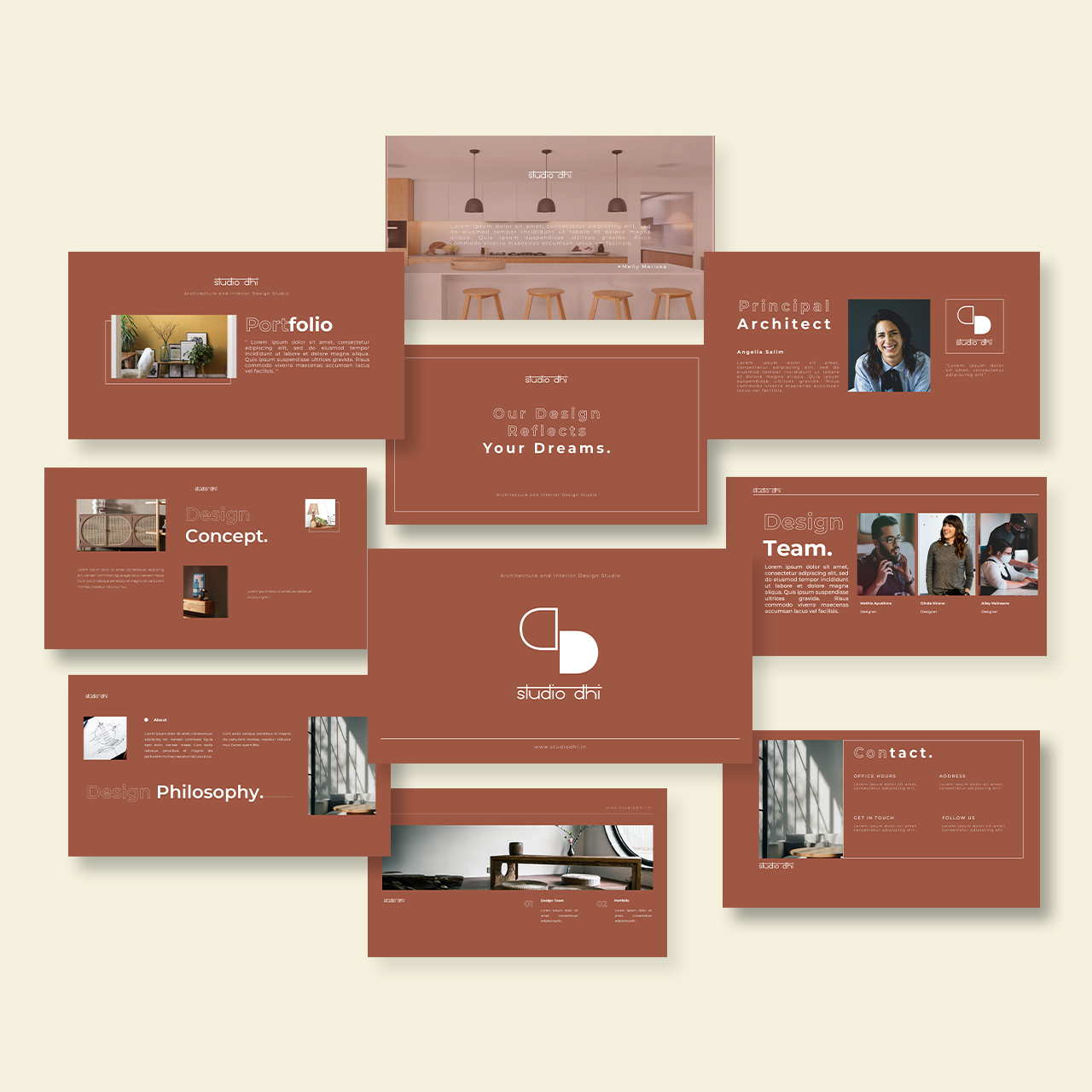
Studio Dhi
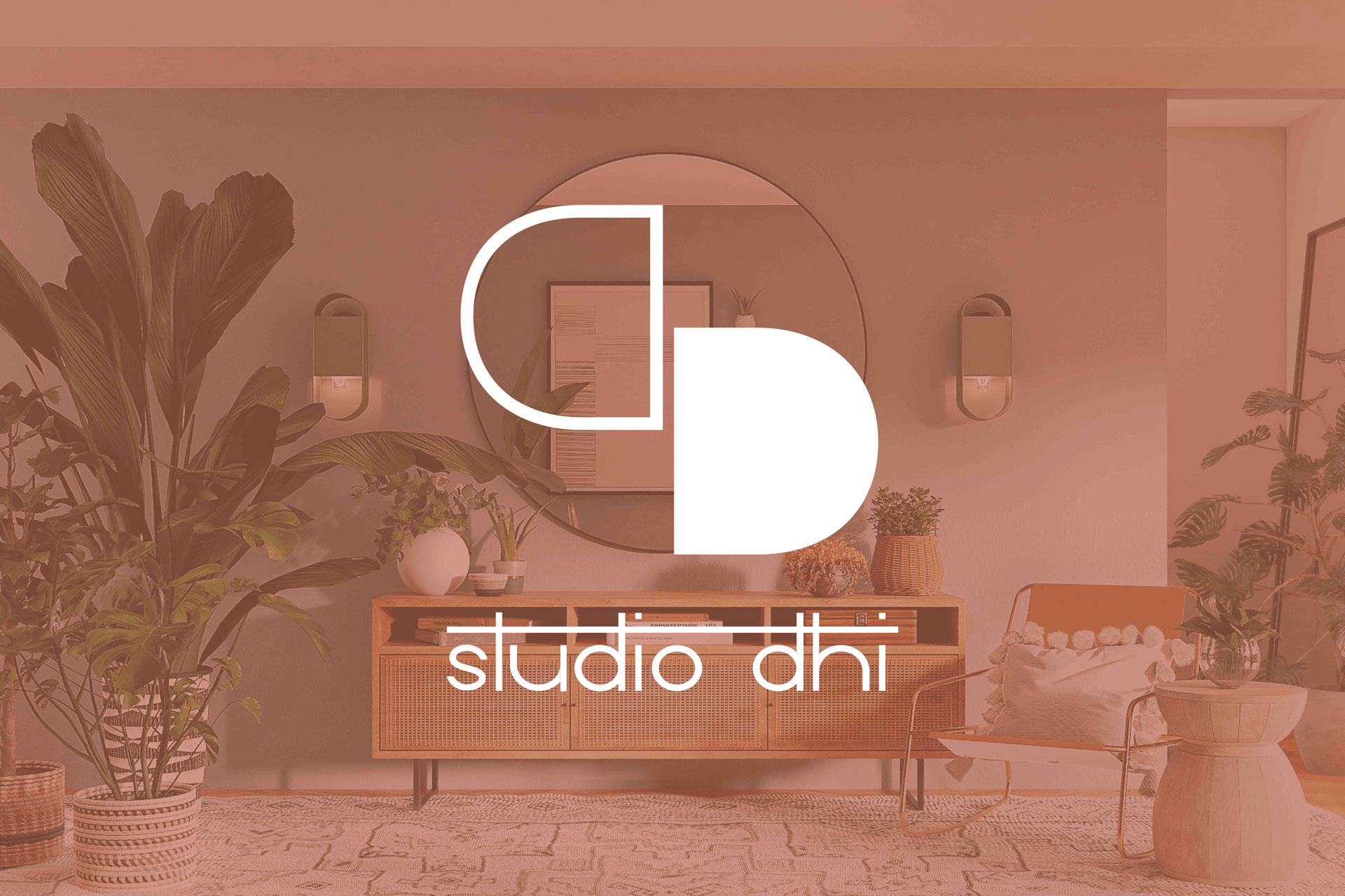
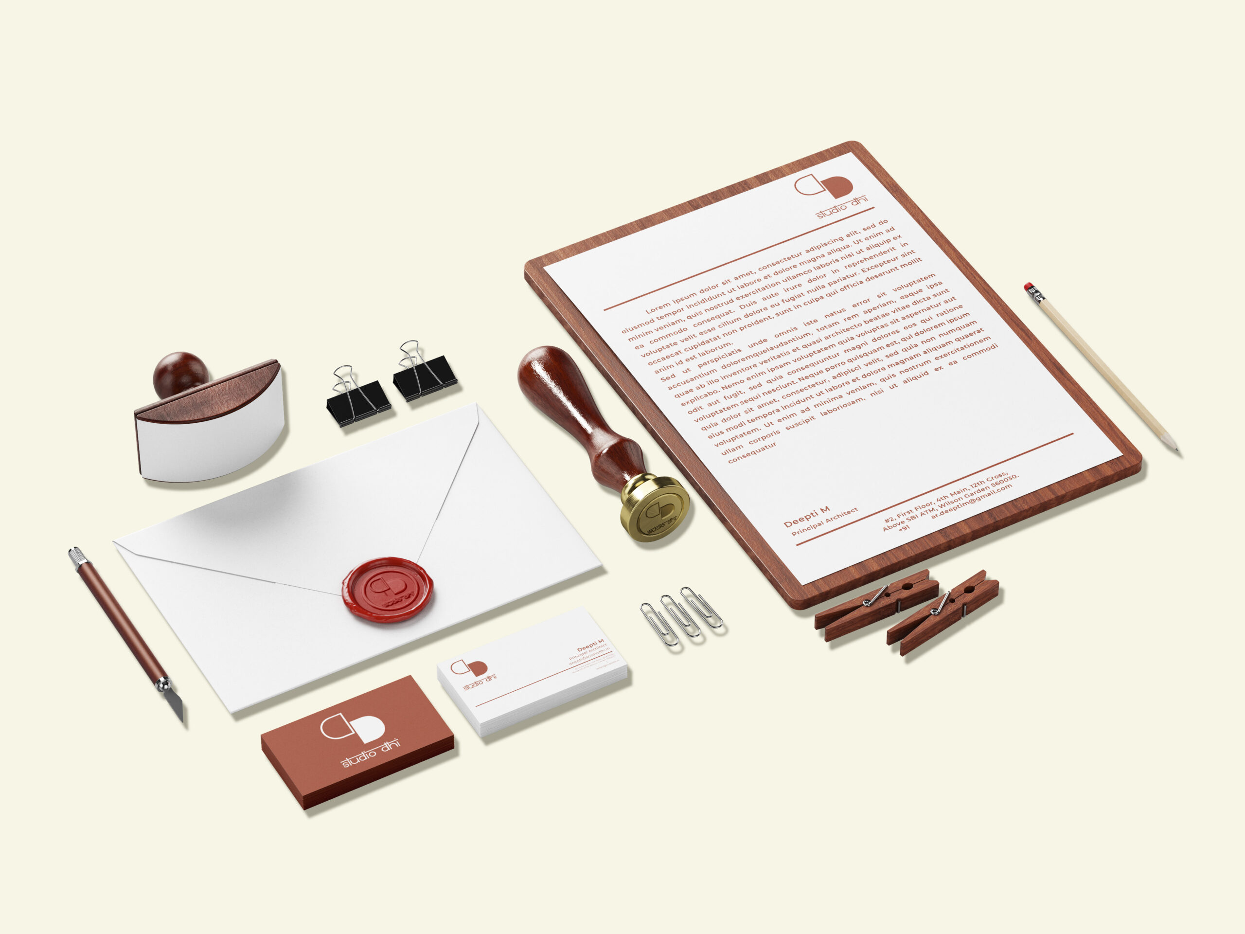
Studio Dhi, a burgeoning design firm, sought a branding and identity solution that would be clean, simple, and concept driven. Drawing inspiration from the Sanskrit word Dhi, which translates to reflection and contemplation, the logo was designed to encapsulate these themes.
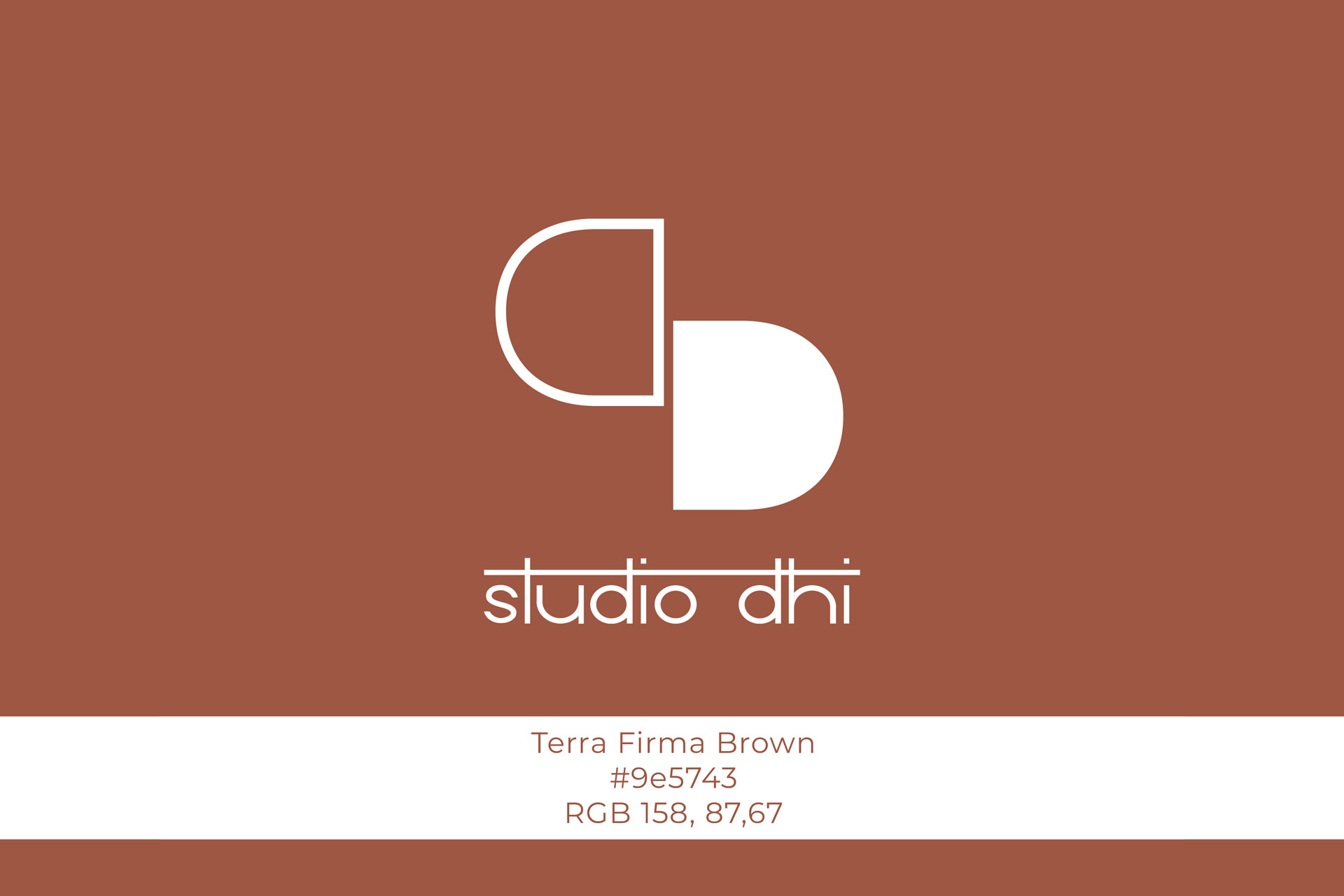
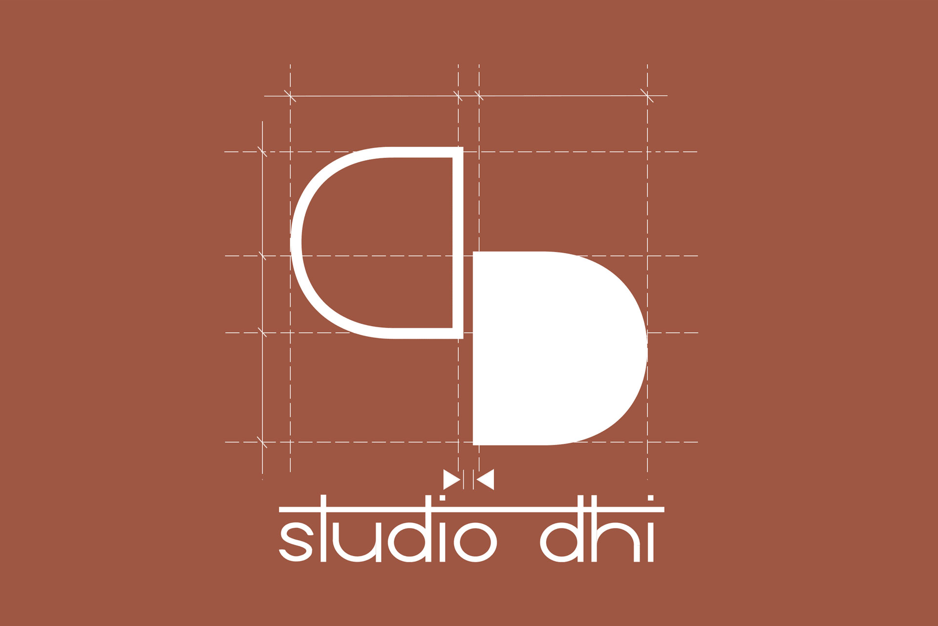
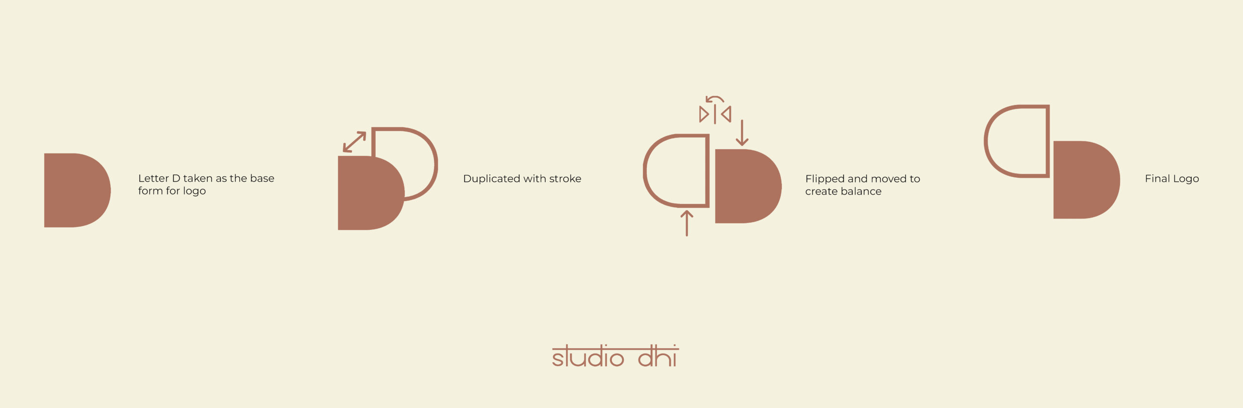
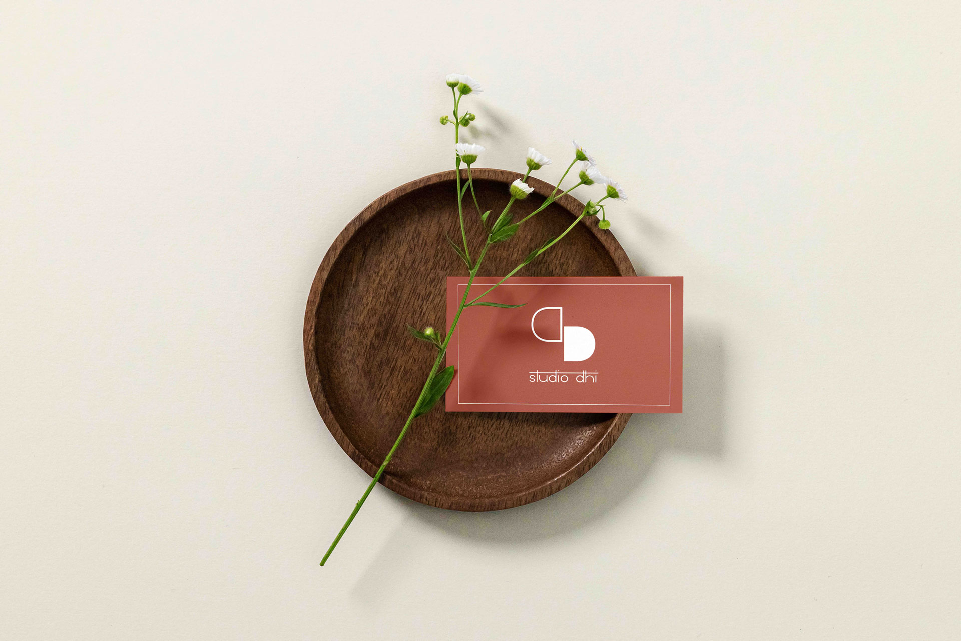
The logo features two staggered, reflected D’s, ingeniously symbolizing the left and right hemispheres of the human brain. The left hemisphere, renowned for its analytical and logical functions, is represented by an outlined D. This choice underscores the firm’s commitment to systematic, methodical, and functional aspects of design development. In contrast, the right hemisphere, synonymous with creativity and intuition, is depicted as a solid D. This represents an imaginative, innovative, and artistic facets of the design approach.
Through this thoughtful juxtaposition, the logo communicates Studio Dhi’s holistic approach to design, seamlessly integrating both precision and creativity. It underscores their philosophy that exceptional design must be both practical and visually compelling. By balancing these elements, Studio Dhi ensures that their creations are not only functional and user-friendly but also imbued with aesthetic sophistication.
This distinctive logo not only reflects the core values and dual focus of Studio Dhi but also positions the firm as a leader in delivering designs that are as beautiful as they are effective. It assures clients that every project undertaken by Studio Dhi will embody a perfect harmony of analytical rigour and creative brilliance, setting a new standard in the design industry.
Client:
Ms. Deepti ManoharLocation:
BengaluruScope:
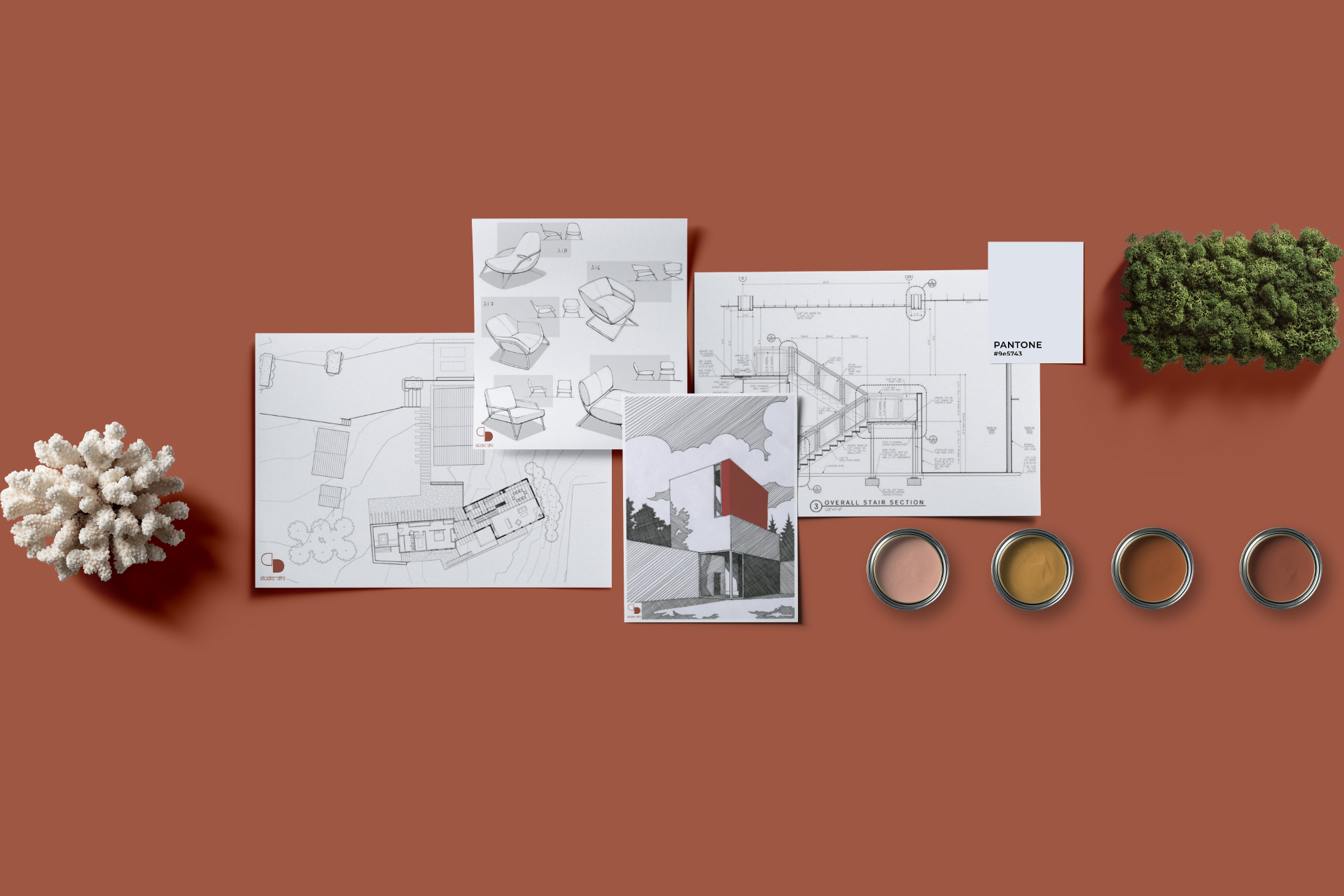
Branding and identityCategory:
Graphics / Identity